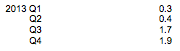
The second estimate of GDP came out recently, and with it the first estimate of NGDP for Q4 2013 (see Britmouse here, see our guide to UK national accounts here). Once again, the growth rate is strong. Here's the quarterly rate:
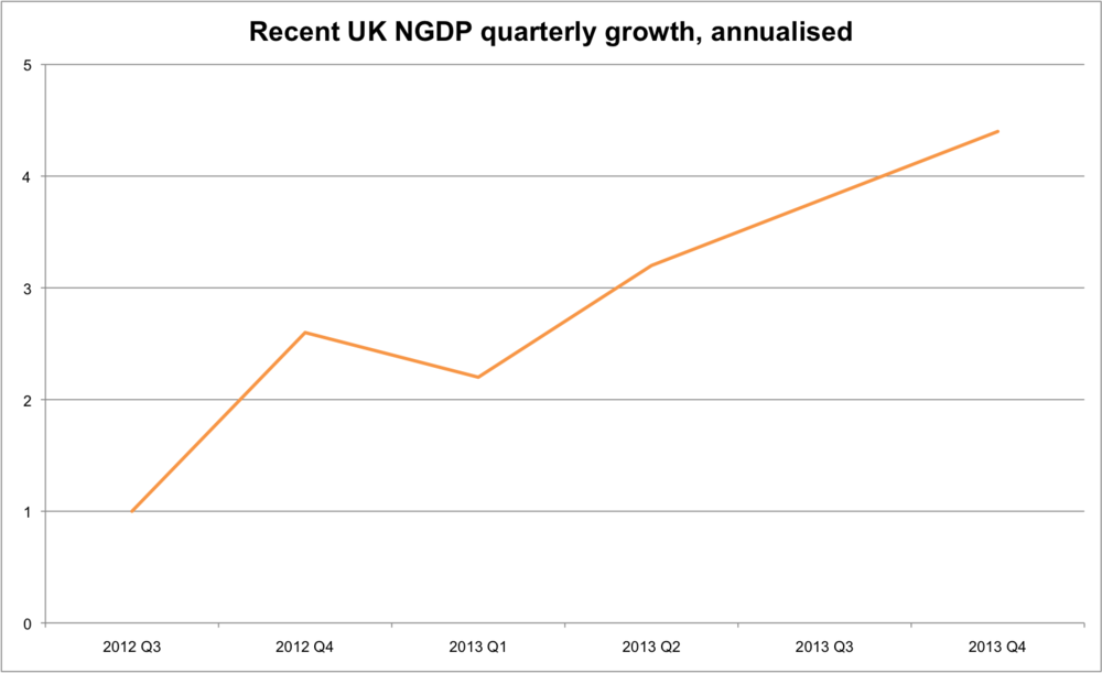
Here's a chart showing the quarterly rate, compared to the same quarter of the previous year (series code IHYO):
I am incredibly sympathetic to market monetarism and feel that they have been consistently ahead of the curve. But identifyng a shortfall of NGDP growth expectations as being the primary reason for the recession, does not necessarily mean that a shortfall of AD is the current problem. Obviously, the charts above leave us some way off where NGDP would be absent the recession. But as with most Austrians, I don't believe that this counterfactual is plausible. Even the most monetarist of market monetarists would agree that an NGDP growth rate of 500% is suboptimal, even if anticipated. Austrians think that the same applies (albeit to a much lesser degree) with one of 5%.
The chart below takes a longer look at what's been happening to NGDP (also QoQ of previous year): 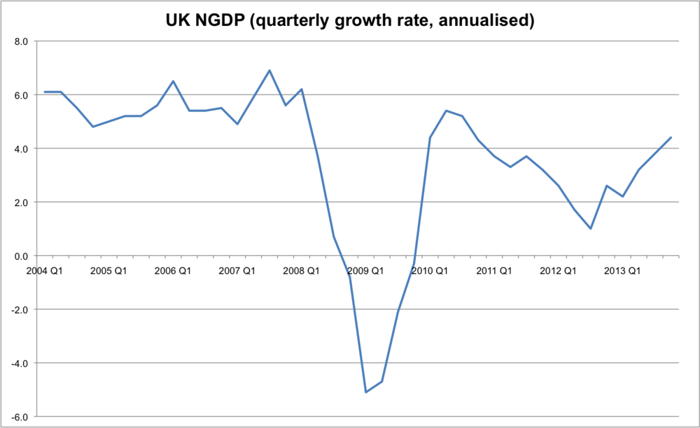 Clearly, the focus on inflation targets rather than collapsing NGDP was a major oversight by the Bank of England. We'd all be better off if monetary policy was more neutral during 2008, rather than being highly contractionary. What I'm less sure of, however, is the argument that monetary policy is too tight right now. The stable door is open. The horse has bolted. Optimal monetary policy would ignore past errors and guide NGDP expectations towards a sustainable growth path. A level target means that bygones are not bygones when shocks occur, for a given target. But since part of the debate is what an optimal NGDP level target would be, it's ok for market monetarists to be wary of loose monetary policy.
P.S. This post is focused on the UK economy. The argument that monetary policy is too tight in the Eurozone is a lot more convincing, and it's plausible that deflationary pressures may become a problem for the UK economy too. If it does, I will change my position.
P.P.S I shouldn't have used the term "annualised" in the charts above. I was confused because I'd just been reading Britmouse's analysis, and he likes to annualise the data. There's two reasons why I prefer to look at the quarterly growth rate, relative to the previous year. Firstly, it is publicly available. When the ONS release the National Accounts you can look at Table A2 and there it is. There's no need to do any calculations. This is preferable because it's easier, and more credible. And secondly, it seems more indicative of what's going on. The chart below compares three quarterly growth rates:
- Quarterly growth compared to previous quarter (IHYN) BLUE
- Quarterly growth compared to same quarter of previous year (IHYO) ORANGE
- Quarterly growth annualised (my calculations) GREEN
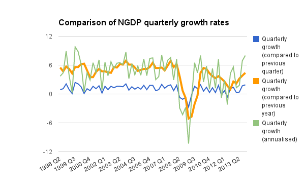
OK, I've cheated and put my favoured one in a thicker line. But if you want a snapshot of NGDP, I believe this is the least erratic, and most useful measure. It also avoids the fact that I've probably made an error calculating the annualised version...